
Today we are happy to showcase an infographic on our previous discussion about color theory and branding. In our previous post we have looked at how important colors are in successfully branding your business and analyzed how choosing brand colors can affect the way your companies message is received.
Since this topic was so popular among our readership we wanted to provide a fun visual to go along with the provided knowledge. Thanks to the information made available by our friends at Color-Wheel-Pro we were able to create an infographic that breaks down the meaning of the most commonly used colours in an easy to use format.
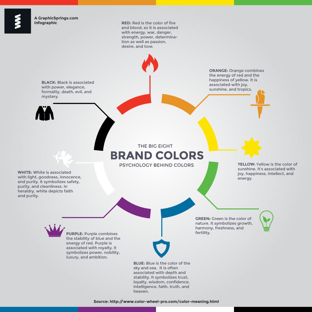
Here are the insights into the psychology behind different colors:
-
Red: Red is often associated with strong emotions such as passion, love, and anger. It can stimulate appetite and increase heart rate. It’s also used to grab attention and create a sense of urgency, which is why it’s often used in warning signs and marketing materials.
-
Blue: Blue is commonly associated with feelings of calmness, serenity, and trust. It’s often used in environments where relaxation and concentration are desired, such as offices and bedrooms. Lighter shades of blue can convey a sense of openness and cleanliness.
-
Yellow: Yellow is associated with positivity, happiness, and energy. It can be attention-grabbing and is often used to convey a sense of playfulness or warmth. However, too much yellow can be overwhelming or cause feelings of anxiety in some individuals.
-
Green: Green is often linked to nature, growth, and renewal. It’s considered a balanced and harmonious color, promoting a sense of calm and tranquility. Green is also associated with wealth and fertility.
-
Purple: Purple is often associated with luxury, creativity, and spirituality. Lighter shades of purple can have a calming effect, while darker shades can evoke a sense of mystery or richness.
-
Orange: Orange is a vibrant and energetic color associated with enthusiasm, excitement, and warmth. It can be attention-grabbing and is often used to create a sense of fun and vibrancy.
-
Pink: Pink is often linked to femininity, love, and tenderness. It’s a soothing color that can evoke feelings of nurturing and comfort.
-
Black: Black is associated with sophistication, elegance, and formality. It can also convey a sense of mystery and authority. However, it’s important to note that black can also be associated with negative emotions like sadness or mourning in certain cultural contexts.
-
White: White is often linked to purity, cleanliness, and simplicity. It can convey a sense of space and openness. In some cultures, white is associated with mourning.
-
Brown: Brown is often associated with nature, stability, and reliability. It can create a warm and comforting atmosphere.
Feel free to use this graph when using our logo maker or working with a client in designing a bespoke brand. Or you can just use our custom logo maker to play around with different color concepts. Whether you are looking for a photography logo, real estate logo, construction logo, or any other branding you can find a suitable design. Our logo designers are also on standby if you’d prefer the help from our team of graphic designers.
David Williams, a seasoned content writer at GraphicSprings with a degree in Marketing, weaves his expertise into engaging articles about logo design, branding, and entrepreneurship. He’s your go-to source for actionable insights in these domains.