
Ready to Get Your Logo?
In a similar way to Google and Apple, Microsoft is one of the big guns when it comes to powerful tech companies. The majority of the world’s seven billion people will, at some point, have used a Microsoft product, whether it’s Word, Windows, Skype, LinkedIn, or an Xbox console. But did you know that Microsoft as a company has existed for four decades? If you’re of a certain age, you might even remember some of the Microsoft logo history – or even the Microsoft first logo! Let’s explore facts about Microsoft and how the logo changed through modern history.
A little bit about Microsoft as a company and its founder
When people hear Microsoft, the first thing that comes to mind is probably its founder, Bill Gates. Despite being only 66 years old, Bill Gates has done some impressive things in his time. He’s been active in the tech industry since his late teens and played a huge role in the creation of microcomputers in the 70s and 80s.
Microsoft has existed as a company since 1975 when Gates was just 20 years old. Initially, the brand was Micro-Soft with a hyphen but this was dropped a year later. The brand name came about as a portmanteau of Microcomputer software. Gates was studying at Harvard when he started the company, but he never returned after his leave of absence.
Ten years after the company started, Microsoft Windows arrived as the company tried to compete against Apple’s Macintosh. Another five years later, in 1990, Microsoft Office was launched and we met the favorites like Microsoft Excel and Microsoft Word that many people still favor today.
Other successes of Microsoft through its history include Internet Explorer, the Encarta encyclopedia, and games such as Flight Simulator.
Nowadays, Microsoft is still as big as it always has been. It brings in over eighty billion dollars each year and has over 100,000 employees globally. It even bought out the company responsible for Minecraft back in 2014.
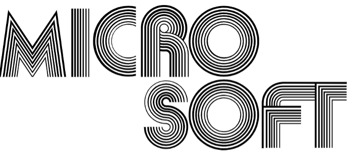
Microsoft First Logo
The two Microsoft founders Paul Allen and Bill Gates made the first Microsoft logo. It was sans serif font that represented the time of its creation (the 70s) well with its disco-style typeface. This logo lasted until 1980 and is the only one to have been over two lines. There were concentric lines to form letters which created an effect of depth.
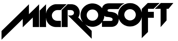
Microsoft Company Logo Redesign 1980
In 1980, the Microsoft logo evolution began. Just like the first Microsoft logo seemed to reflect the disco feel of the 70s, the Microsoft logo 1980 looked to be inspired by this decade’s heavy metal music.
The redesign was entirely different with the logo only using a single line for the first time, unlike the old microsoft logo. The font was also more aggressive with sharper angles and diagonals. Many people describe it as similar to the iconic Metallica logo, which is considered to be the most recognizable of metal logos ever. It’s safe to say that the Microsoft logo makers certainly considered how the logo reflected the time. However, as designs like this age, Microsoft only used this logo for a couple of years.
All brands can learn from this. When using a logo maker, try to design your logo to be timeless. This way you won’t have to create a new one when trends change.
The Blibbet
The next Microsoft logo change involved the introduction of the “Blibbet” in 1982. This is when the company moved away from trendy music-styled logos and Microsoft logo old design and chose a logo that was more corporate in feel. In this logo, the company name was written in a sans serif font that was common.
Aside from the first letter “O”, which looked like a disc, the logo was basic. The center “O” was even used on its own as a symbol for the company. Lots of employees at Microsoft really liked this design and petitioned to keep it when it was being redesigned in 1987.

A Redesign Lasting Over Twenty Years
In the late 80s, Microsoft redesigned its logo once again. This time, the company used a different sans serif font, Helvetica, that is still in common use by many brands today. The only special feature of this new logo was that there was an additional space between “O” and “S” in the center, which was perhaps designed as a nod to the company’s beginnings as Micro-Soft.
The logo would last for twenty-five years before being redesigned once more, though it did have two slogans added in this time. The first, in 2006, was “Your potential. Our Passion.” and the second, in 2011, was “Be what’s next.” By adding slogans to their logo, the company was able to freshen up the feel of it without a redesign. When using a logo maker to create a design, this is something to consider.
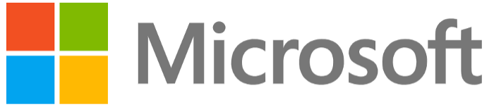
Microsoft Logo New Design for 2012 – What is the Microsoft logo now?
The final Microsoft logo overhaul happened in 2012 and this logo is still being used today some ten years later. This logo design was created after employees met several times. The italic, bold, Helvetica typeface was replaced by the relatively common Segoe UI sans serif font.
The most notable part of the Microsoft logo change was the addition of the four-square symbol and the use of color.
Microsoft had always used black in its design but the font had now switched to gray, and the four squares – representing a window to be reminiscent of Microsoft Windows – each had a different color. Some people believe that the four colors represent a different aspect of Microsofts products with the blue representing Microsoft Word, the green representing Excel, and the yellow representing Bing or Outlook.
Final Thoughts
To summarize, it’s perfectly acceptable to change your company logo from time to time just as the Microsoft logos have changed. One of the best things you can do when using a logo maker, though, is to create something that’s timeless. Why not seek feedback from employees, customers, and friends in your logo design? Whatever design you choose, as this company has shown, it’s not a bad thing to redesign your logo until you have something you’re completely happy with.
Ready to Get Your Logo?
Lukas is part of the content writing team at GraphicSprings, bringing his marketing expertise to the forefront. With a degree in Marketing, he crafts informative articles on social media, branding, and logo design.