
Ready to Get Your Logo?
As is commonly said, you never get a second chance to make a first impression. It takes around seven seconds for you to make an impression – and the same goes for your business.
Your brand needs to create a great first impression. If you only have seven seconds to do it, your logo needs to be strong and powerful. That’s where a monogram logo can help. A monogram brand logo is sentimental and simple. It conveys your brand’s whole narrative just through a few digital pen strokes. A monogram logo design will emphasize your brand name and build strong connections with your audience.
What is a monogram logo?
Monogram logos are often considered to be the most exquisite and beautiful logo types. Here you can read up on the other most common logo types. To describe them simply, they differ from other logos because they have letters within their design. Take this design, for example.
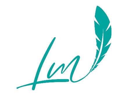
Straight away, we understand that this is from a business focused on writing. The letters create a memorable logo that is instantly recognizable.
Monograms logo are also called lettermarks. Usually, there’ll be 2-3 letters made up from the business initials. If there is just one letter, it’s usually referred to as a letterform rather than a monogram. Owing to the strong emphasis on the letters, the font used can give off a different impression.
Monograms became popular during the 19th century and have remained popular ever since. You can find monogram logos everywhere from wedding stationery and on paintings. Above anything else, a monogram logo stands out as a symbol of professionalism, class, and luxury.
Different types of monograms
Monograms have been around for centuries. There are three particular types:
• Crown Monograms – Royal families all over the world have often adopted an official monogram that has been applied to their clothing or seals on letters, for example.
• Brand monograms – 2-3 letters from a brand’s name make up its logo (this is what we’re focusing on today)
• Personal monograms – popular at weddings and used on invitations, clothing, and cakes. Personal monograms are also seen on christening invitations and gifts too.
When to use a monogram logo
When designing a business logo, you should always consider your audience. The logo needs to be appealing visually as well as speaking out about your core business values. The audience you attract will connect with your values. A monogram is memorable. Generally, they look crisp, clean, and classy. You should consider using one if:
1. Your business is a luxury brand
Service or luxury branding will make customers feel looked after. When you think of a luxury brand, you often have customized towels, pillows, and pens, which are often associated with high-end clientele. A monogram logo reminds people of the feeling they have when they stay in a luxury hotel, for example.
One brand that relies on its monogram logo is Louis Vuitton. Its logo has been around for centuries and is a simple serif font that is visible not only in stores but is adorned all over the brand’s products too.

2. Your business name is wordy
Since monograms usually use 2-3 letters, it’s a good idea to use one if your business name is long or hard to say. A long or complicated brand name won’t be as iconic as the initials of the same brand. Using initials creates intrigue and your audience is invited to find out more about the brand.
As a business owner, it’s also important to have a logo that people can read easily. People don’t spend ages staring at logos so you need something that is quick to grasp. Having a longer business name will negate the point of a logo, using letters will show people immediately what you’re about.
Take this example:
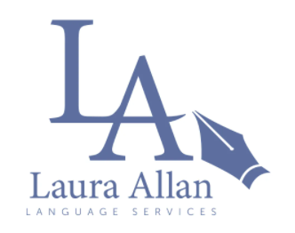
While Laura Allan Language Services is a wordy business name, the monogram logo of the L A and a fountain pen immediately give you a logo that is eye-catching and tells you straight away what the business does.
3. If your business is international
It’s hard to make a logo that’s appealing to different audiences around the world. You need to consider cultural differences and language barriers. This means a monogram is ideal. Think of a big international brand like H&M. Their monogram logo is instantly recognizable no matter where you are in the world.
4. Keeping it in the family
Due to monograms use of initials, they’re great to use when combining names. They’re often used for wedding paraphernalia for this reason. Monogram logos have become synonymous for bringing two names together, which is why they’re great for businesses. They’re a fantastic way to emphasize family values and create emotional connections with the audience.
A great example of this is the Gucci monogram logo that uses interlocking Gs. With a bold, serif font, this monogram also emphasizes its history and tradition.

5. If you don’t want to limit your brand
If you have plans to expand your business beyond its current remit, you might want to consider a monogram logo. For example, if you’re currently a business consultant but you’re considering expanding into other consultation areas, using a monogram logo won’t limit you in your hopes of expansion. An architect might use a logo that depicts a building for example, but this would mean that they later can’t use their business name for other ideas.
6. Your brand name is (or could be) an acronym
We’ve already mentioned longer names but sometimes brand names can be shorted to form an acronym. One such example is the brand 3M.
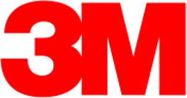
The multinational company that is 3M was originally called the Minnesota Mining and Manufacturing Company). As you can see, this has been shorted into 3M to represent the 3 Ms in the initial name – and it has worked really well as a recognizable brand and monogram logo.
Advantages to using a monogram logo
• Style – this type of logo can suit any business style. It is simple and can portray the right message that you want your audience to see.
• Unique – monogram logos are often very unique and it’s unlikely to find yourself with a similar logo to another company. The uniqueness of monogram logos comes in the letters, font, shape, style, and color.
• Scalability – monogram logos are much easier to scale. This means they can be resized depending on the device used and won’t lose any clarity. Even when monogram logos are small, it’s still easy to know what they are and who they represent.
• Noticeable – a monogram logo is noticeable. Letter combinations are much easier for a person to remember over a complicated logo and so potential clients will notice and recognize your logo wherever you choose to display it.
Monogram arrangements
There are lots of different monogram style logos, here are some to consider:
• A single initial – one letter used with decorative flourishes.
• Block monogram – this is popular with monograms of three letters where all of the letters have the same width and height.
• Traditional monograms – this is used a lot with names. The middle letter usually represents the last name while the side letters are smaller and represent the first and middle names.
• Stacked monograms – this is good for three letters with the letters stacked on top of one another
• Interlocking monograms – this is usually used with cursive fonts or fonts with flourishes.
• Circles – usually used with two or three letters with the letters shaped to form a circle.
• Diamond monograms – the letters fit inside a diamond shape or take on a diamond shape.
• Split letters – there might be a small, overlapping area inside the monogram.
Design Ideas for Monogram Logos
If you’ve decided that a logo monogram is right for you and your business, you’ll need to come up with a few design ideas before sitting down with a logo maker. Here are some tips to help you get started.
1. Think about different fonts and typefaces
A great monogram logo has a great typeface. Choosing the right one will showcase your brand. If you want a timeless and traditional feel, chose a serif font (ones that have little lines at the end of letters e.g. Times New Roman or Courier New.)
If, however, your brand is innovative, uses new technologies, or has a modern slant to it, you should probably stick with a sans serif to show your audience that idea.
You don’t have to stick two letters side by side and be done with it. Consider the likes of Gucci (who interlock the Gs) or the New York Yankees (who place the letters on top of each other). If you do choose this approach, make sure, though, that the letters look right on top of each other or in a different direction and don’t just look like a confusing mess!
If your brand name is a person’s name, you could try using a script typeface to imitate a signature. Lots of cursive fonts can mimic handwritten signatures and will portray sophistication and elegance.
2. Choose brand colors
The colors you choose for your monogram logo play a part in your brand message. Different colors are often associated with different meanings. The colors you choose can make your audience feel a certain way about the brand. There’s a reason why fast food places emphasize red – all the big brands like McDonald’s, Burger King, KFC, Pizza Hut, Domino’s, and Wendy’s all use red – and most use yellow too. Why? Because this color apparently stimulates hunger.
When thinking about what colors to choose, consider what emotions you want to evoke in your audience. Generally speaking, blue tones symbolize trustworthiness, stability, and reliability while green tones signify nature, wealth, and health. Usually, a business monogram will have one to three different colors but there are some like PlayStation, Microsoft, and CNBC that have opted for more.
With more than three colors, you generally appeal to younger people and give off a youthful, playful, and energetic vibe. Using lots of colors does risk you confusing and cluttering your message and design. Also, with lots of colors, there’s a chance your logo will clash when placed on different backgrounds so you’ll need to know where and how your logo will be used before committing to lots of color.
3. Play around with your layout
The great thing is that all logo makers let you experiment with the layout of your logo. However, it’s often something that people overlook when designing a monogram logo because they think just having the letters is enough.
Though most monogram logos are rectangular, it is possible to play around with the layout to communicate something different to your customers. The Yves Saint Lauren logo has letters stacked vertically almost like a chain. The letter Y is at the top and slightly to the left above the L, while the S is in the middle and links them all together. Linking letters in this way is a great way of connecting your brand.
Other things you could try are mirroring the letters in your logo, sacking them, interlocking them, or surrounding them with a frame.
4. Play around with the negative space
When you’ve considered the major elements in your monogram logo design, why not try out using the negative space i.e. the space between the letters. It’s possible to arrange elements in your logo so that any empty space creates its own message or image.
Using negative space is a way of creating a really imaginative and clever logo that draws in people’s attention.
5. Creating hidden meanings
Lots of monogram logos have a hidden meaning so think about whether you could do something like that with your initials. Take the LG logo for example.
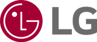
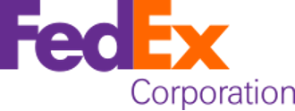
The LG logo is a monogram technically speaking but they have played around with the letter sizing and spacing to create a face. Also, the FedEx logo is clever too. Have you noticed that the negative space between the E and the X is in the shape of an arrow? Though this uses more letters than a typical monogram, it has this symbol to show the audience that they mean business when it comes to delivering their packages.
So, look at the letters in your logo and see if you can create something meaningful with them based on your brand and business.
Final thoughts
Every business has its own story and having a monogram logo might be the best way to tell its story. If you choose a monogram logo, don’t forget to consider the font carefully. Think about the message your brand is trying to create and whether it’s about innovation or traditionally timeless. Color is an important consideration too, as is the layout. All things combined can create a wonderful monogram logo that’s synonymous with your brand.
Ready to Get Your Logo?
Lukas is part of the content writing team at GraphicSprings, bringing his marketing expertise to the forefront. With a degree in Marketing, he crafts informative articles on social media, branding, and logo design.