Ready to Get Your Logo?
The coffee powerhouse that is Starbucks is hugely successful at what it does. Over the years, it’s grown to be a global dominator for chain coffee stores. You can find more than 30,000 Starbucks stores in over 80 countries of the world. One part of the Starbucks success story comes down to branding. The product, name, and logo design are such a success that they’re recognized all over. When companies get their branding spot on, it’s the brand that comes to mind when you need a service or product. For example, referring to tissues as Kleenex, all brands of vacuum cleaner as a Hoover, stick glue as Pritt stick, and Blu-tack as, well, Blu-tack! But, what about Starbucks? How did it start? What is the Starbucks logo history? What about the Starbucks logo meaning?
Starbucks history (and some facts about coffee)
So the story goes, circa 800AD, an Ethiopian shepherd noticed his goats not sleeping and being active after munching on coffee bean plants. He discussed what he’d observed with a local abbott who made a drink from the beans to help him stay awake and the rest is history!
But, it took a while before coffee became popular around the world. It has been rivaled with tea in many countries and areas. When coffee began to increase in popularity, it was often the milder, low-quality coffee that was served to customers.
In 1971, three friends and business partners, Jerry Baldwin, Zev Siegl, and Gordon Bowker, were inspired by Alfred Peet, an entrepreneur in coffee roasting, to sell coffee. Because they believed brands with the letters “st” at the beginning sounded powerful, they initially called their coffee shop Starbo, which was a Cascade Range mining town. This evolved to be Starbuck following the Moby-Dick chief mate’s name. The store was opened at 2000 Western Avenue, Seattle. In these first years, Starbucks bought green coffee beans from Alfred Peet of Peet’s Coffee and Tea) and only sold beans rather than drinks of coffee.
Fast forward to 1986 and Starbuck had six Seattle stores and had sarted selling espresso coffee too. The company was bought out in 1987 and began opening locations in Vancouver and Chicago. Starbucks has continued to grow every since (apart from in the late 2000s during the global recession). Now, they’re the biggest coffee store chain in existence.
Starbucks logo history
Starbucks has an iconic, eye-catching logo. It’s recognizable and memorable, which is great for increasing brand awareness and brand loyalty. It could be said that the current Starbuck logo is somewhat minimalist if we compare it to previous Starbucks logos. This helps them capture their brand on a variety of products and platforms including t-shirts, cups, and other materials used to promote the brand.
Let’s look at the history of the Starbucks logo.
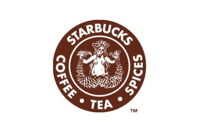
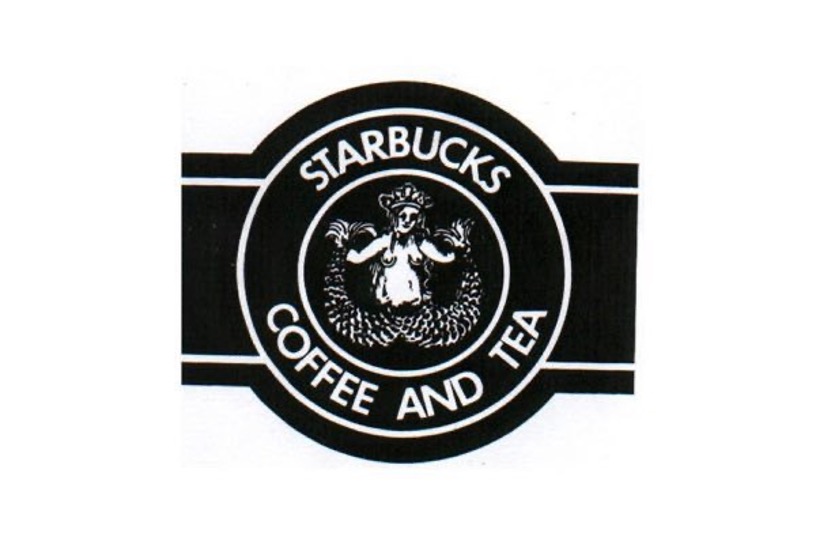
The original Starbucks logo from 1971
With the link to Starbuck from Moby-Dick, it’s no surprise that the original Starbucks logo had a naval, mermaid theme. This mermaid, however, had a twin tail. This siren (as she would be called in Greek mythology) would be responsible for luring sailors who would go on to graph their ships. The idea behind this as a logo was that the Starbucks siren would lure people to buy delicious coffee.
The Starbucks original logo was a coffee-colored circular design, which meant they could spin their branding text around the edge. As well as Starbucks, they incorporated the words coffee, tea, and spices.
The Starbucks logo evolution begins in 1987
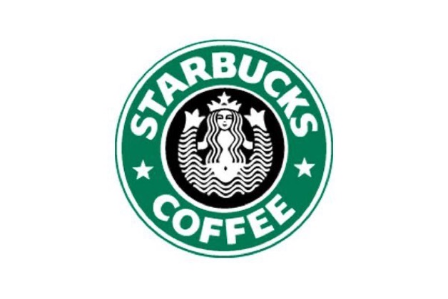
The Starbucks logo stayed the same for over fifteen years. However, in 1987, Howard Schultz bought out the brand and decided to redesign it. An artist called Terry Heckler was hired to come up with the new logo. He drew his inspiration from Seattle being a port town and he wanted the design to be a new start with fresh opportunities for growth and success. Thus, there were some substantial changes to the logo.
Like the old Starbucks logo, Heckler kept the two circles and siren symbol. However, the mermaid underwent a makeover with her hair now covering her breasts. Though she kept her crown, she became much more streamlined.
With the fresh start, the logo color was changed form brown to green, and the words “spices” and “tea” were dropped from it. Two stars were added to connect the words “Starbucks” and “coffee”, and a more modern Starbucks Coffee logo was born.
The next changes to the Starbucks sign
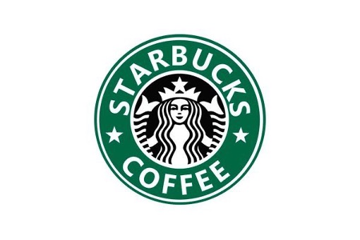
There was a further logo refresh in 1992. This time, the Starbucks logo was zoomed in to show the mermaid in a more closer-up and intimate view. You could no longer see her navel and there was only a small amount of her tail visible. The brand typeface also appeared more modern and professional, which gave the logo a cleaner feel.
A change for the 40th anniversary
In 2008, to celebrate the 40th anniversary of Starbucks, the company reimagined the original Starbucks logo but added some modern twists. The logo changed to be black and the mermaid was back in her full-frontal glory.
However, there was a huge backlash and the rebranding was a flop. Because their previous branding of the green and white circle had become so iconic, Starbucks customers were in uproar.
And back again…
Starbucks didn’t revert their branding back to the former logo style straight away though. It was a few years later. But, in 2011, they realized just how successful their brand was and rebranded again to revive elements of the previous, green logo. It now had a modern, minimalistic feel with familiar elements that customers were happy with. It shows how much branding matters. If you ask Starbucks customers about the branding in 2008, most won’t remember the black redesign – they’ll be shocked that the green design hasn’t been around forever!
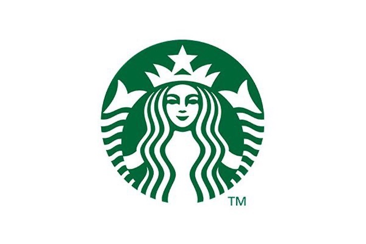
In this rebranding, they did away with the outer circle, stars, and wording. The logo simply focused on the mermaid, who became larger and had her features redesigned to create symmetry. Starbucks claimed they wanted to rebrand to connect with and appeal to all of their global customers.
Elements of success in the Starbucks logo design
Small companies (and even large ones) can learn a lot from studying the logos and branding of big corporations when using their own logo maker.
The Starbucks logo has lots of elements of success to it. It is seen like a recognizable and unique mascot that is renowned the world over.
From the start, the Starbucks logo was strongly connected to the brand. The brand and logo have always been synonymous. Without the logo there is no coffee and without the coffee, there is no brand.
If we look deep into design configurations when using a logo maker, we recognize that circles are a great element to use. Whether it’s to print on a sticker, bag, cap, or pen, a circle works well. Circles are also symbolic of global journeys – which Starbucks has certainly gone on!
With an emblem logo like the Starbucks one, a brand can create a timeless and traditional design for the company. The success of it could also be put down to its simplicity in color. The green is a great nurturing, natural color that evokes kindness and compassion. As far as effective logos are concerned, the Starbucks logo is a prime example.
Now to replicate these elements in your branding…
By creating an instantly recognizable brand and logo, Starbucks has shown how when branding is done well, it creates a huge success for the company.
If you’re looking at rebranding your logos, or you’re starting to use a logo maker for the first time, consider what you can learn from big, successful corporations like Starbucks. The Starbucks logo over the years has gone round in circles so remember, that even big companies like this make mistakes like the 2008 rebrand design! Ouch!
When it comes to your logo, seek advice from friends, family, and customers or potential customers. Consider whether the logo will age well and whether or not it’s timeless. Rebranding for a small company can be an expensive task so consider things carefully before setting things into motion.
Nowadays, brands are opting for cleaner, more legible logos. While 2021 did see a shift towards vintage-style rebrands (think Burger King going back to a design from the 1990s), remember how this didn’t fare well for Starbucks! We are a logo design company that also offer bespoke branding services. Get in touch to find out how we can help you create a professional corporate identity like Starbucks.
Lukas is part of the content writing team at GraphicSprings, bringing his marketing expertise to the forefront. With a degree in Marketing, he crafts informative articles on social media, branding, and logo design.