It’s the summer festival season, and music fans around the world are eyeing the posters filled with band names to see if they can spot the logo of their favorite musician.
From The Rolling Stones’ cheeky tongue to Nirvana’s cross-eyed smiley face, well-designed and memorable band symbol logos can become the symbol that fans of their music recognize them by. In addition to simple letter based logos, these iconic symbols sometimes end up representing the artists themselves, living well beyond their active era.
With Lollapalooza just around the corner, here are five best logos of artists that are gracing the stages at this year’s music festival.
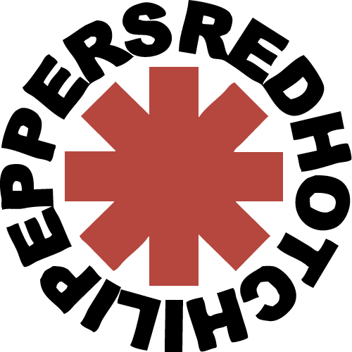
The legendary funk rock outfit made music history when the band was inducted into the Rock and Roll Hall of Fame in 2012. Throughout the band’s 33-year-long career, RHCP underwent member replacements and significant style changes, but one thing remained constant: their symbol.
Often referred to as the “Star of Affinity” or the “Star of Infinity,” the eight-pronged red asterisk became the band’s seminal logo, tattooed onto the forearms of the members and many fans around the globe.
RHCP front man Anthony Kiedis said the symbol didn’t have any meaning — he simply sketched the icon when record executives asked the band to come up with a logo for promotional purposes.
2) RADIOHEAD
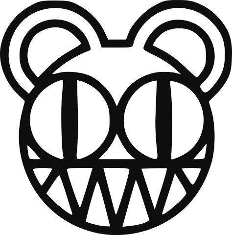
This chameleonic English rock group with three Grammy Awards under its belt is more than just music. People describe the band’s music as alternative rock, art rock, electronica, experimental rock and so much more. They are also known as the band with bear logo.
Nothing represents the band’s social awareness and enigma and quirkiness better than the bear symbol designed by Stanley Donwood, an English artist responsible for the entirety of Radiohead’s album and poster art since 1994.
Nicknamed “Modified Bear,” the sinister-looking face first appeared in the artwork for the band’s critically acclaimed album “Kid A” (2000), and has been a recurring motif in the band’s work ever since.
Front man Thom Yorke reportedly claimed the design of the terrifying bear face was the product of his deep paranoia of genetic engineering.
3) MIIKE SNOW
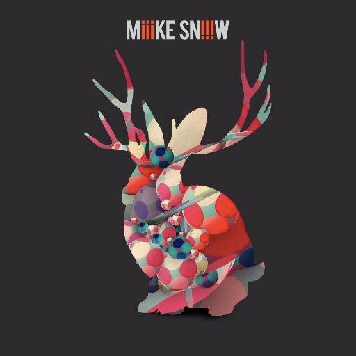
Can you guess what that enigmatic animal-looking logo of the Swedish indie pop band is supposed to be?
According to an interview by Esquire UK, the band’s famous logo is a silhouette of a jackalope, a mythical North American animal that looks like a rabbit with antelope horns.
Band member Christian Karlsson claimed that his tattooist came up with the symbol and he liked it because it represents something “cold and Nordic.”
4) DISCLOSURE
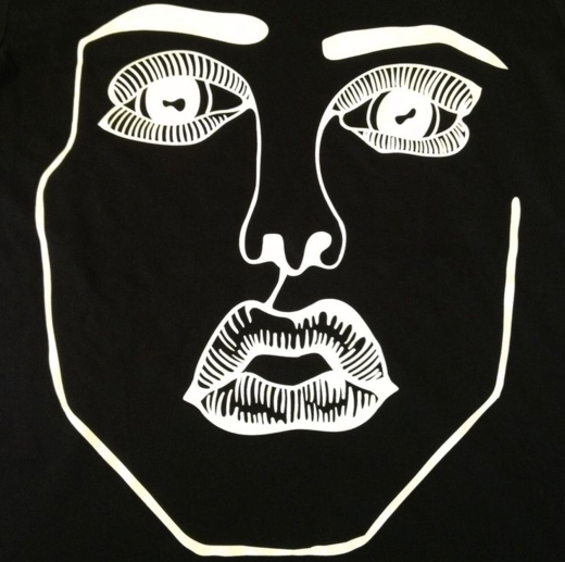
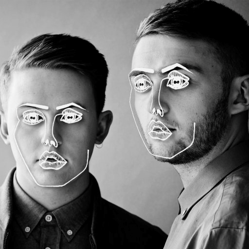
This young electronic music duo comprised of brothers Howard and Guy Lawrence soared to the top of the charts in 2012 with their single “Latch,” which featured vocals by Sam Smith. Since then, the duo has headlined massive music festivals and earned several Grammy Nominations.
Their signature logo is the “Scribble Face” — a minimalistic drawing of an androgynous face in white lines. According to Complex, a friend of the duo’s management scribbled the face when designing the artwork for their first release. When they couldn’t afford a new artwork for their next single, they used the face again.
After that, the “Scribble Face” superimposed on actual photographed faces became the duo’s signature icon in their artwork, promotional photo shoots and merchandise.
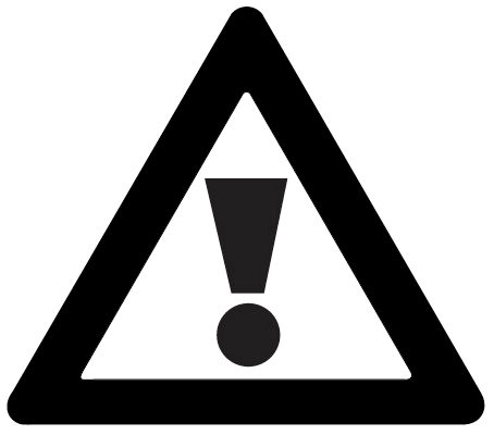
These bad boys of electronic music have taken up the world of EDM by storm with their heavy hip-hop and trap influenced beats. With bass-heavy drops and crazy mosh pits a signature of the DJ duo’s high-octane live shows, it’s fitting that their universal logo is a simple triangular warning sign.
The symbol has evolved throughout the years from a simple black sign against white backdrop to more elaborate 3D renderings with various colors.
According to THUMP, the symbol is an homage to old-school hardcore and house records, many of which featured street signs on the covers. After fans repeatedly tweeted the warning sign at them after they used the logo on one of their releases, they decided to make it the emblem of their music and their fans.
CREATE YOUR OWN LOGO NOW
Love what you see? You don’t have to be a stadium-filling mega rock star to have your very own high-quality custom logo design that truly represents who you are.
Take a look at our collection of Free Entertainment & The Arts Logos, and check out our Free Logo Maker and Custom Logo designs to start creating your own unique and memorable logo in minutes!
David Williams, a seasoned content writer at GraphicSprings with a degree in Marketing, weaves his expertise into engaging articles about logo design, branding, and entrepreneurship. He’s your go-to source for actionable insights in these domains.